Imagine transforming a basic rental into a welcoming haven that not only reflects your personality but also enhances your mood and well-being. By understanding and applying the principles of color psychology, you can easily change the entire vibe of a room, by combining and layering elements in different, complementary colors. In this article, we will explore how you can use colors strategically to create a vibrant and comforting environment in your rental apartment.
Understanding Color Psychology
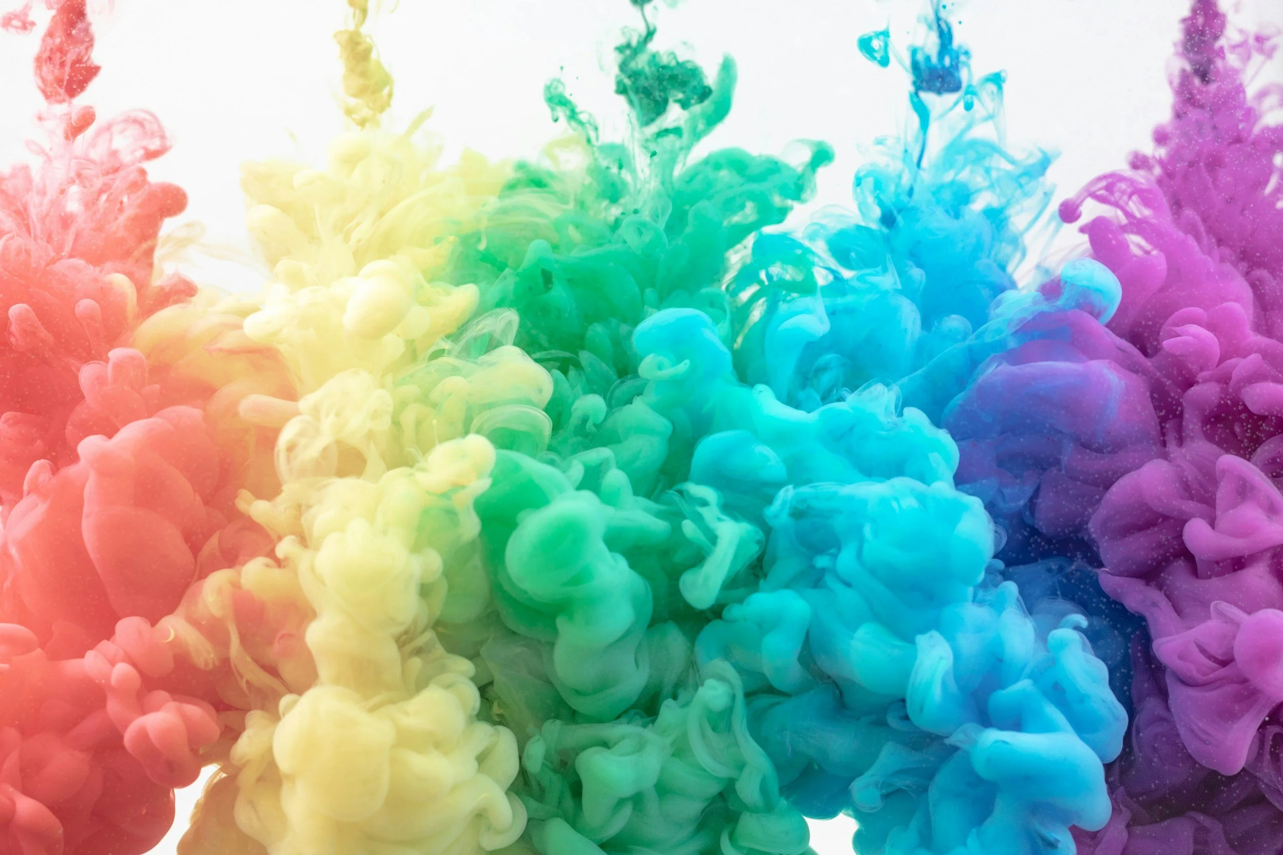
Color psychology is a fascinating field that explores how colors impact our emotions and behaviors. In the context of rental design, choosing the right colors can transform your space from merely functional to truly inspirational. Here’s a deeper look at how specific colors can influence the atmosphere of your home:
Red
Energizing and intense, red is a powerful choice that can stimulate conversation and appetite, making it an excellent color for dining areas. It is associated with passion and excitement, which can be perfect for accents in living rooms or entryways. However, because of its stimulating properties, it’s best to use red in moderation, as too much can be overwhelming and attract too much attention to certain areas, creating visual clutter.
Blue
Known for its calming effects, blue is the ideal choice for bedrooms and bathrooms, where relaxation is key. Light blues can evoke feelings of peace and tranquility, helping to soothe the mind and promote restful sleep. Darker blues, reminiscent of the twilight sky or deep sea, can lend an air of formality and depth to a space, perfect for a home office or study.
Yellow
This bright and sunny color evokes feelings of happiness and vitality. Using yellow in a kitchen or a small breakfast nook can make the space appear more inviting and energetic. In dimly lit or smaller spaces, a pale yellow can help expand the space visually and bring in a burst of sunshine. However, like red, intense shades of yellow should be used sparingly as they can be overpowering if used too much.
Green
Green is the color of nature and is associated with renewal, health, and harmony. It’s an excellent choice for almost any room in your home, especially places where you want to promote balance and calm, such as a living room or a home office. Lighter greens can make a room feel fresh and bright, while deeper emeralds can introduce a luxurious and serene vibe.
Neutral Tones
Neutral colors like white, beige, and gray are the backbone of many interiors because they form a flexible base for decorating. They can be warmed up or cooled down with accents and are reflective, making the most of any natural light in a space. Neutrals are particularly useful in rentals, as they allow for endless personalization with other colors and textures.
By understanding how these colors impact the look and feel of a space, you can better decide how to incorporate them into your rental to create a desired mood or atmosphere. Choose colors wisely so that they align with the emotions you wish to evoke in each room, creating a harmonious living environment.
Practical Application in Rentals
As a renter, you may face limitations when it comes to modifying your living space. Here are some actionable tips on how to use color effectively within those constraints.
Removable Options
Consider removable wallpaper or wall decals to add splashes of color without the commitment required by paint. These can be easily switched out if your tastes change or when you move.
Accessorize
Use throw pillows, rugs, curtains, and artwork to easily introduce color to your apartment. These elements can dramatically alter the feel of a room and are easy to change periodically. Plus, they add different textures, creating depth and contrast in any room.
Statement Furniture
A piece of furniture in a bold color can become a room’s focal point. Think a turquoise coffee table or a mustard armchair—such focal points draw the eye and set the mood for the rest of the space. They work best in complementary colors to neutral bases, so make sure you pick a muted background for such pieces. And since we’re talking about rentals, choose multipurpose furniture to enrich your storage and organizational solutions.
Adapt Lighting
The right lighting can shift the way colors look within your home. Experiment with different bulbs to see what enhances your décor best—warmer lights tend to enrich reds and yellows, while cooler lights complement blues and greens.
Window Treatments
Curtains and blinds are not only functional but can also be a major element of your color strategy. Choose hues that complement your room’s overall palette, and make sure you hang them high enough in order to create the illusion of height.
DIY Decor
Engage in DIY projects like painting canvases or creating fabric wall hangings to add more personalized touches of color. These projects can be a fun and affordable way to bring unique elements to your rental.
Conclusion
Utilizing color psychology in your rental can do more than just beautify the space; it can create an environment that positively impacts your daily life. By choosing colors that enhance both the aesthetic and the mood of your home, you can create a place that feels uniquely yours, even within the limitations of renting. Embrace these strategies to make your rental a true reflection of your style and spirit.
For a unique approach to color psychology and organization that makes efficient and elegant use of the space within your home, contact Let Your Space Bloom today!